Trekinn Website

Boosting Online Presence through Brand
Trekinn Homestay is a well-established homestay in Hualien—a popular gateway to some of the most scenic areas in Taiwan. Trekinn has two double queen bedrooms and three king-sized bedrooms. Primary clients consist of young adults that enjoy outdoor activities as well as families with young children.
Branding
Design Brief
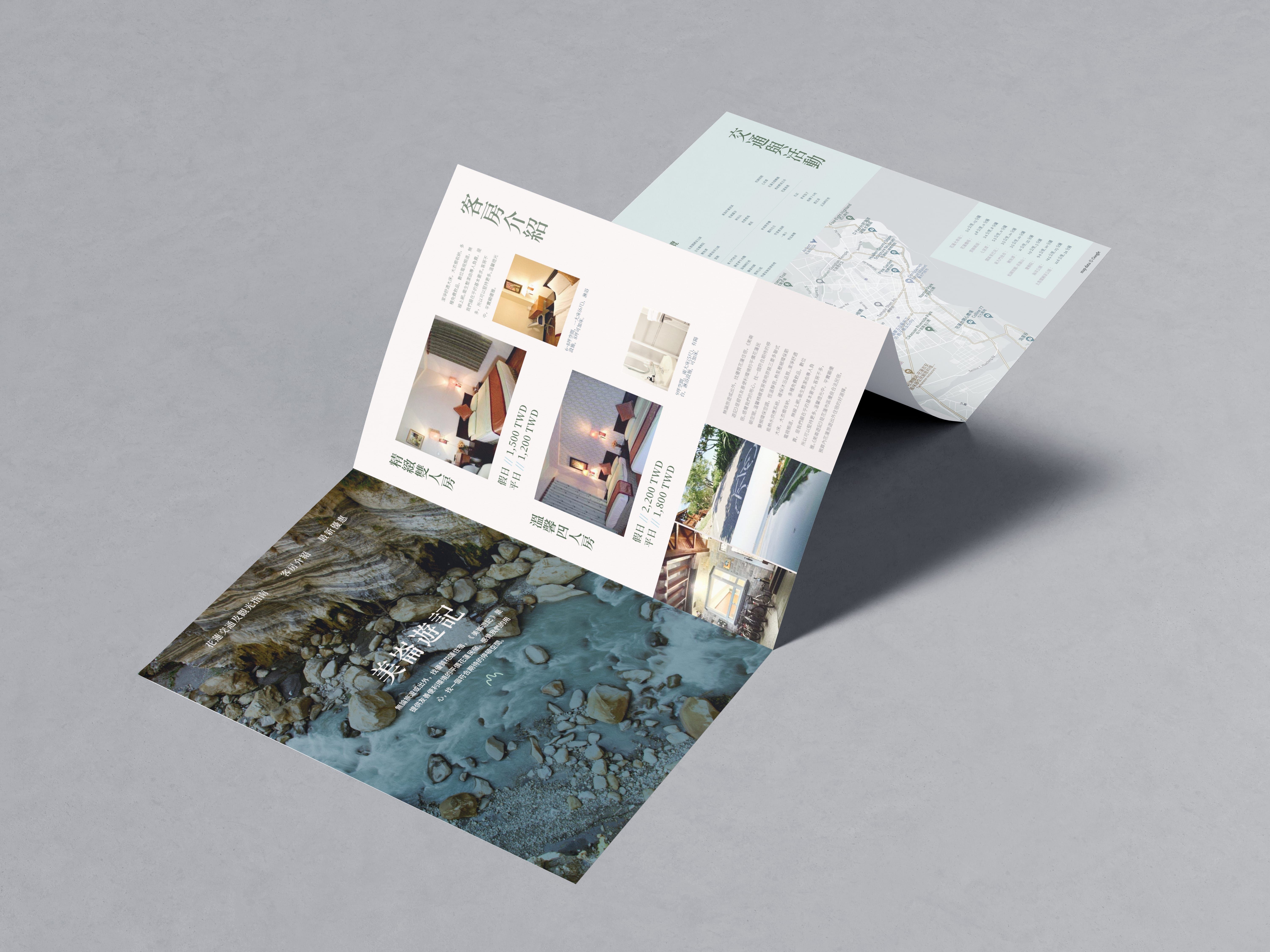
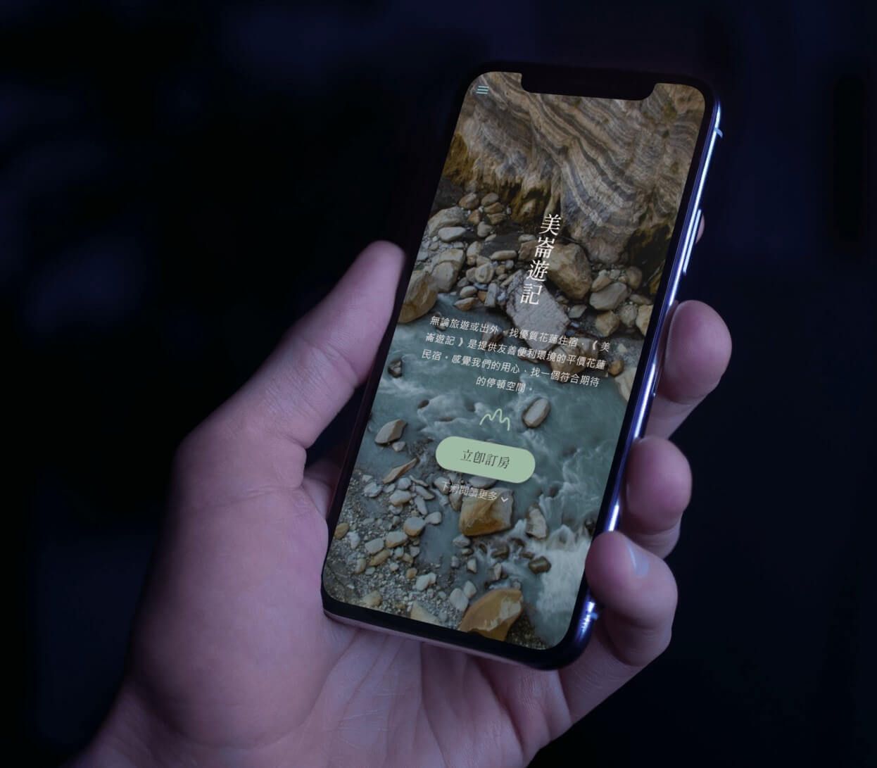
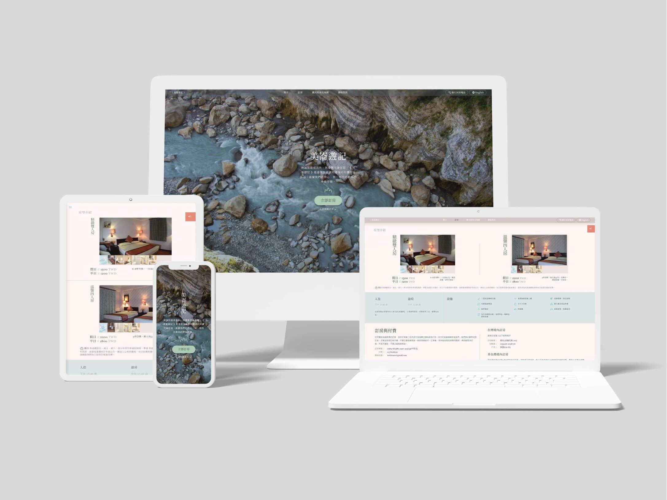
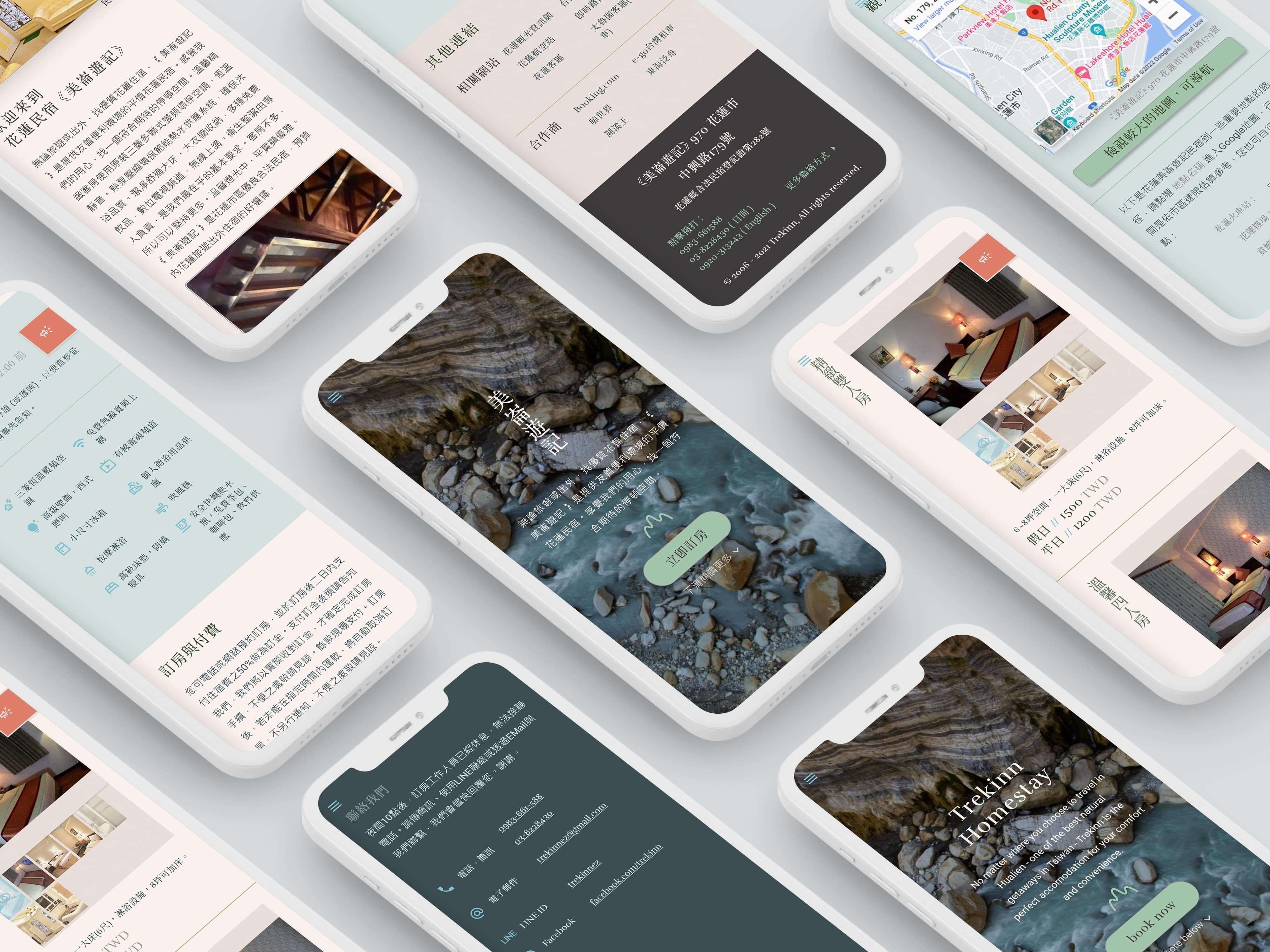
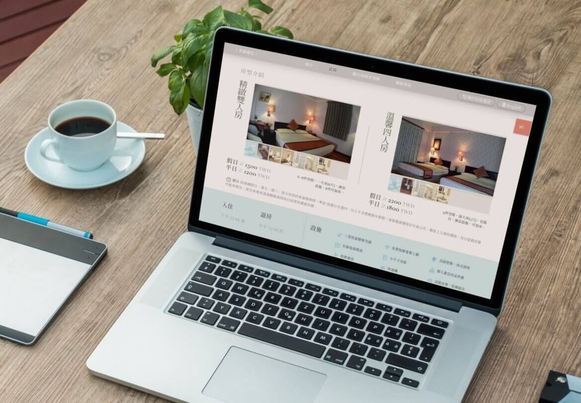
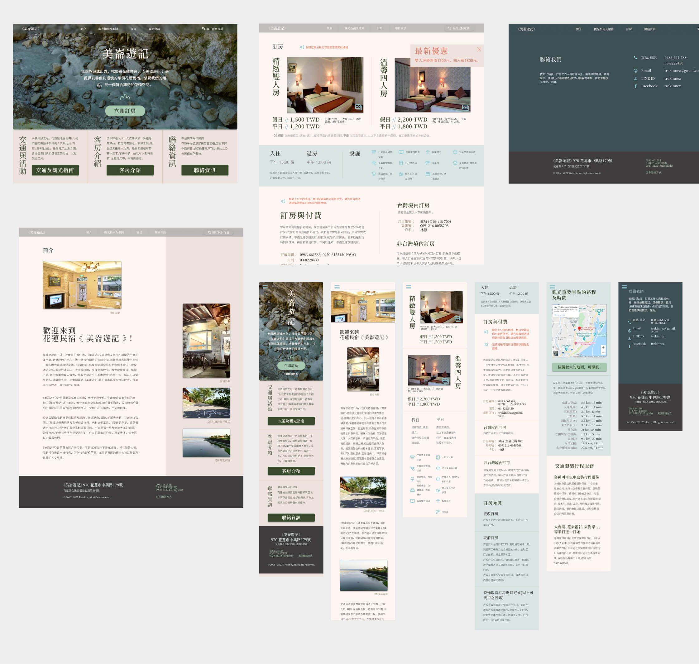
The original website already had good content and a direct, trustworthy voice: “We know our way around, and can help you make the most of your trip.” For this project, I spent the most time on content reorganization. I reorganized sections, added internal links, and separated out Chinese and English versions. In terms of visual enhancement, I wanted to craft a simple but effective brochure-inspired visual system. It should underscore the existing message: cleanliness, location, and local expertise.


Color and Photography
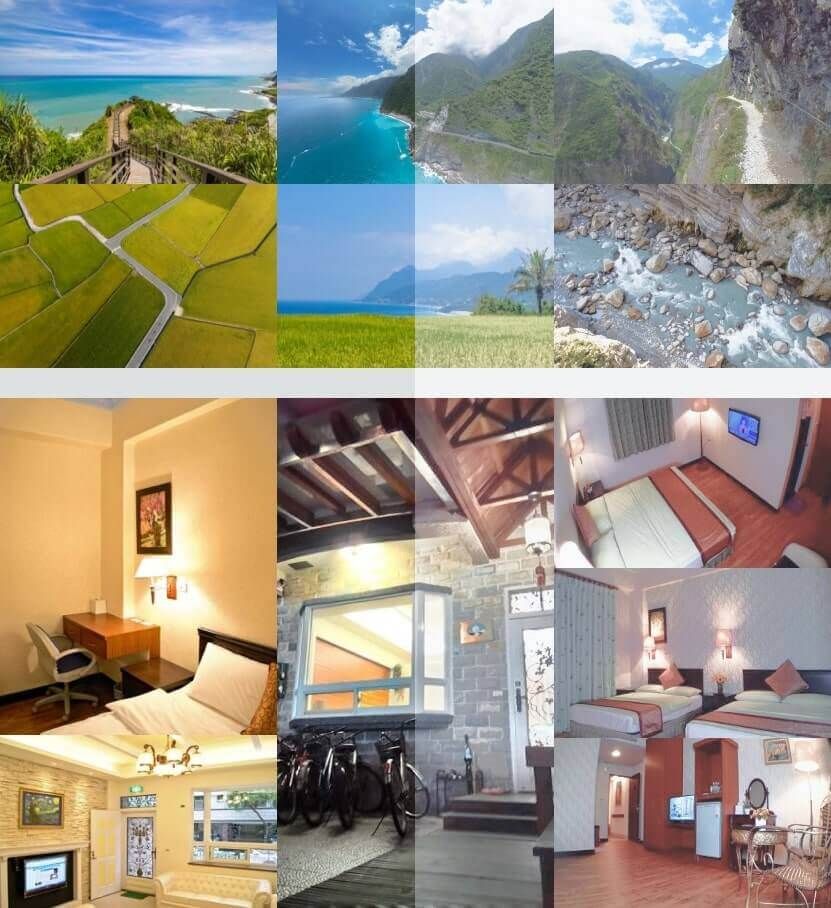
To highlight Trekinn's local roots as well as appeal to nature-loving guests, I knew that photography would be a key visual. Luckily, I was able to source some gorgeous nature photos from the county's tourism beaureau. I kept the web palette toned down in complement of these photos.
Typography
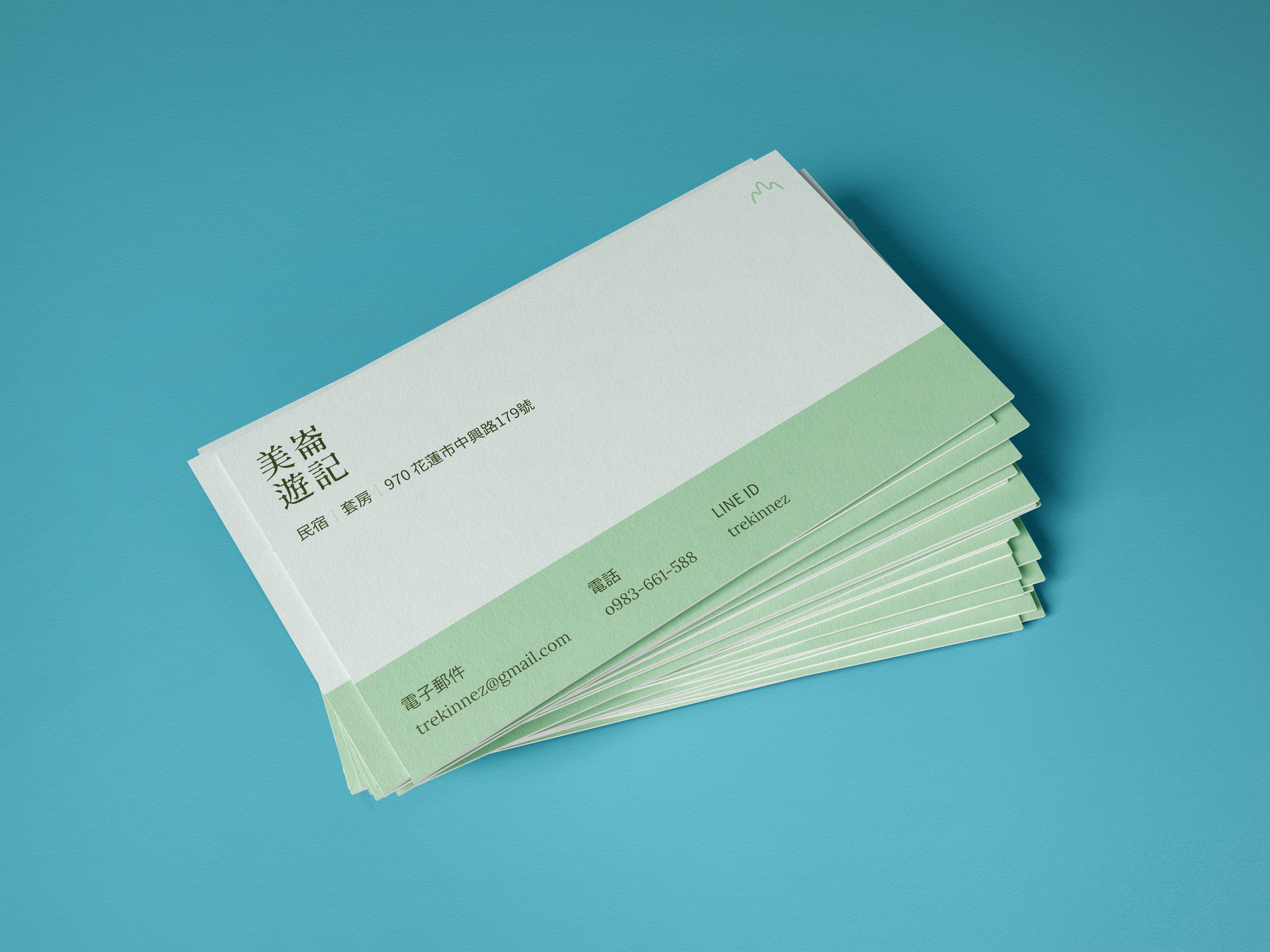
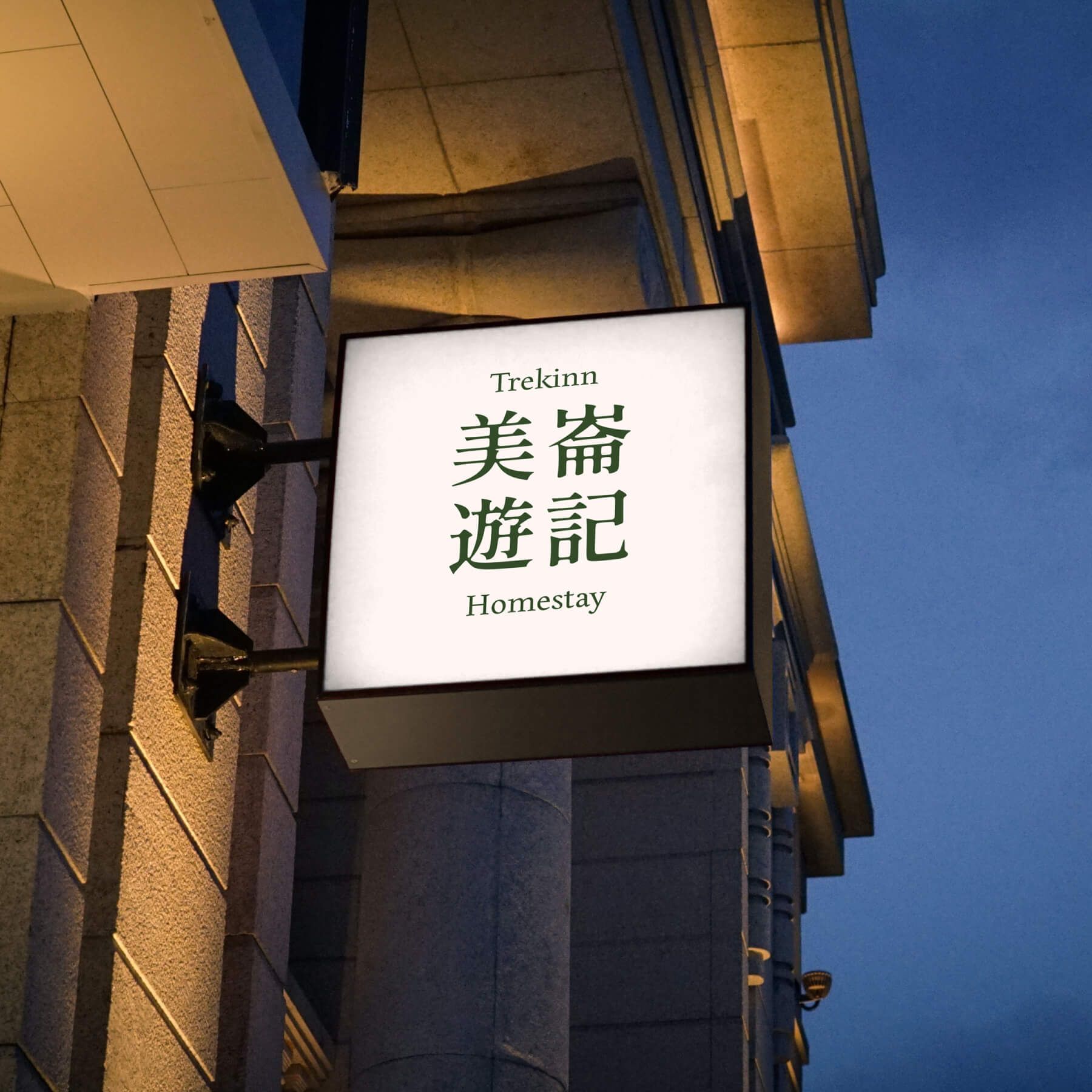
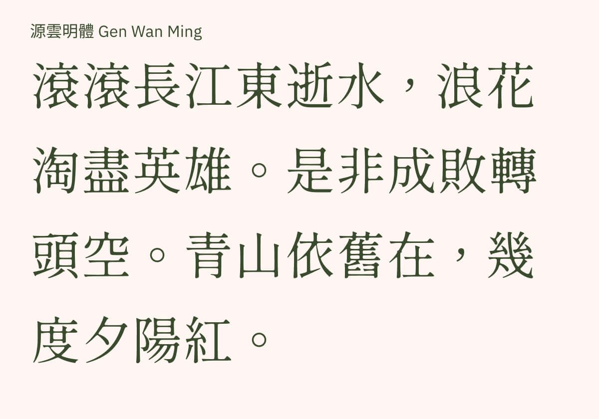
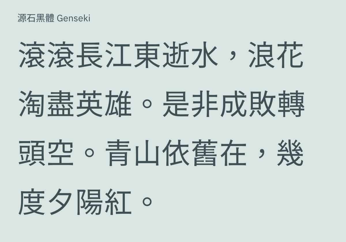
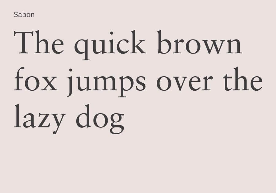
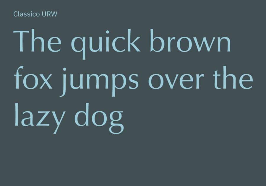
Since most of Trekinn's clients were Taiwanese, my design approach was Chinese-first. I chose Gen Wan Ming, an elegant Ming font whose slight ink spread evokes both homeliness and nostalgia. The typeface paired well with the existing copy's trustworthy tone. For the body text, I chose Genseki, a sans-serif font. I wanted the English fonts to have comparable features to the Chinese fonts. I chose Edita as the complement to Gen Wan Ming, and, after butting heads with numerous sans-serif fonts, chose the humanist Classico URW as the counterpart to Genseki.
Web Design
User Flow
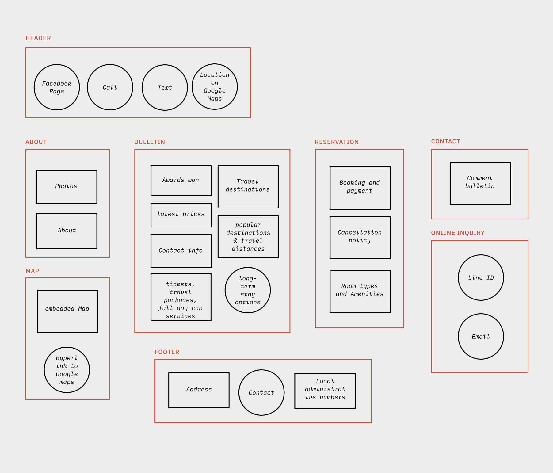
The original website provided much value to users by listing local points of interest and their relative position and distance to the homestay. There existed some thoughtful features such as the "call" CTA that allowed users to quickly reach reception. My goal was to improve the accessibility of these features.
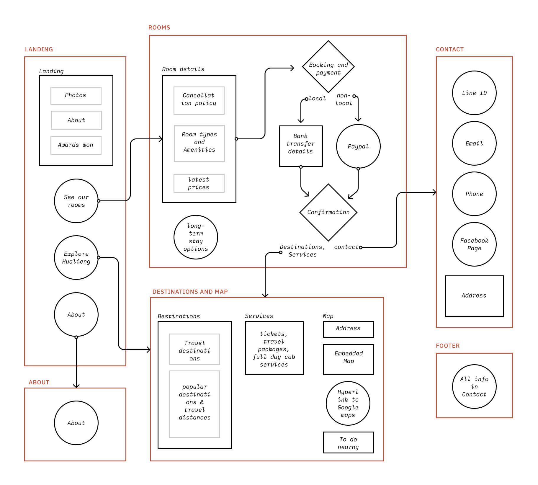
I ended up organizing site information into five pages: Home, About, Rooms, Map & Destinations, and Contact. The home page provided an entry point into each page. I also placed relevant internal links wherever needed, such as a "Map & Destinations" link in the "Rooms" page, right next to "booking information".
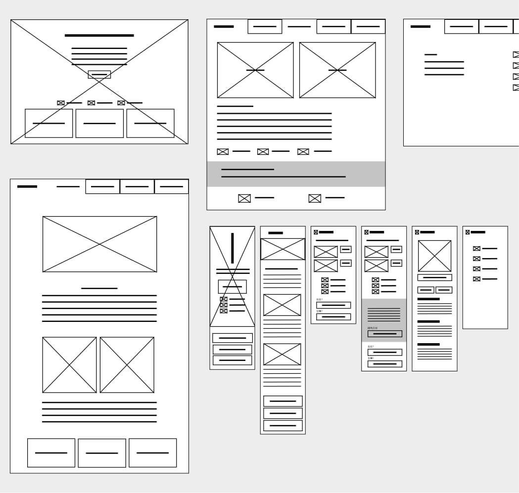
Wireframes
Development
Technology Stack
I used React and Tailwind CSS for this project.
Highlighted Features
Internationalization
Instead of creating a separate English version of the site, I used React i18n, which allowed for in-app language switching.
import i18n from "./../../i18n.js";
import { useTranslation } from "react-i18next";
import NavLink from "./NavLink.js";
const Navbar = () => {
  const { t, i18n } = useTranslation();
  return (
    <nav>
      <NavLink linkText={t("Navbar.trekinn")} linkRoute="/" />
      <NavLink linkText={t("Navbar.about")} linkRoute="/about" />
      <NavLink linkText={t("Navbar.rooms")} linkRoute="/rooms" />
      <NavLink
        linkText={t("Navbar.destinations+map")}
        linkRoute="/destinations+map"
      />
      <NavLink linkText={t("Navbar.contact")} linkRoute="/contact" />
      <NavLink linkText={t("Navbar.home")} linkRoute="/" />
      <div
        onClick={() => {
          i18n.changeLanguage(t("Navbar.language"));
        }}
      >
        {t("Navbar.changeTo")}
      </div>
    </nav>
  );
};
export default Navbar;
//translationZHTW.json
{
"Navbar":{
"trekinn":"《 美崙遊記 》",
"about":"簡介",
"destinations+map":"觀光指南及地圖",
"rooms":"訂房",
"contact":"聯絡資訊",
"changeTo":"English",
"language":"en"
}
}
//translationEN.json
{
"Navbar":{
"trekinn":"Home",
"about":"About",
"destinations+map":"Travel guide",
"rooms":"Rooms",
"contact":"Contact",
"changeTo":"中文版",
"language":"zhtw"
}
}